Söhnlein Brillant — Registered in 1964 as the first German sparkling wine brand, it represents the democratization of sparkling wine in Germany. Thanks to Söhnlein Brillant, almost the entire German population was able to afford sparkling wine for the first time.
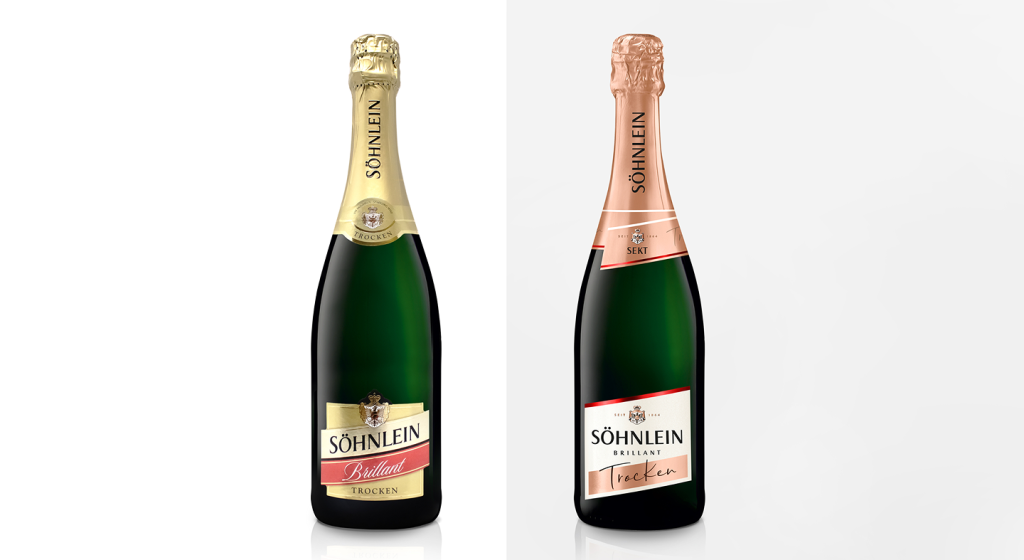
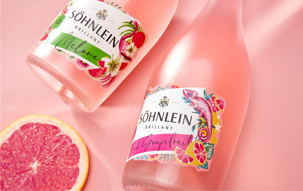
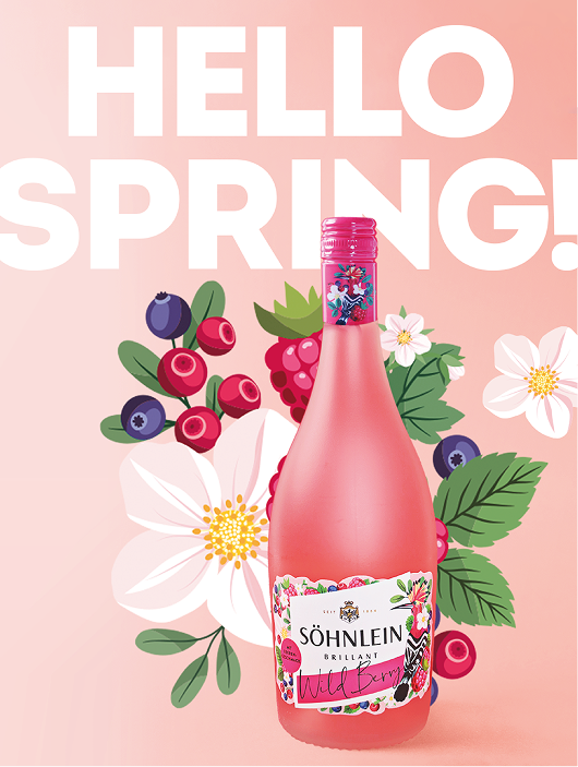
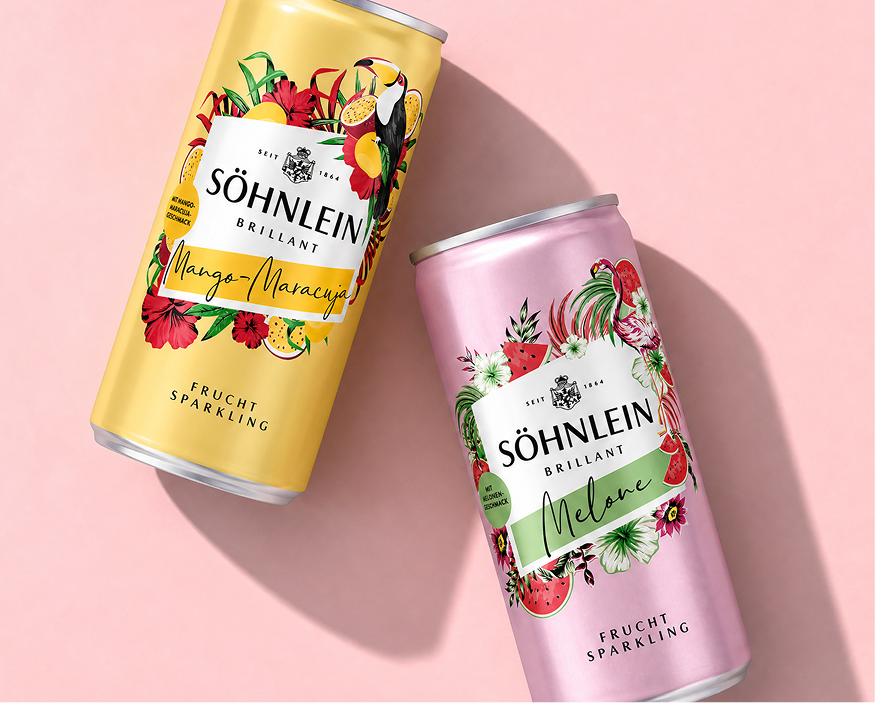
The goal of the relaunch was to modernize, rejuvenate, and add emotional appeal to the brand, while also creating a clear, consistent brand image that unifies the range of classic wines, specialty sparkling wines, and limited editions.
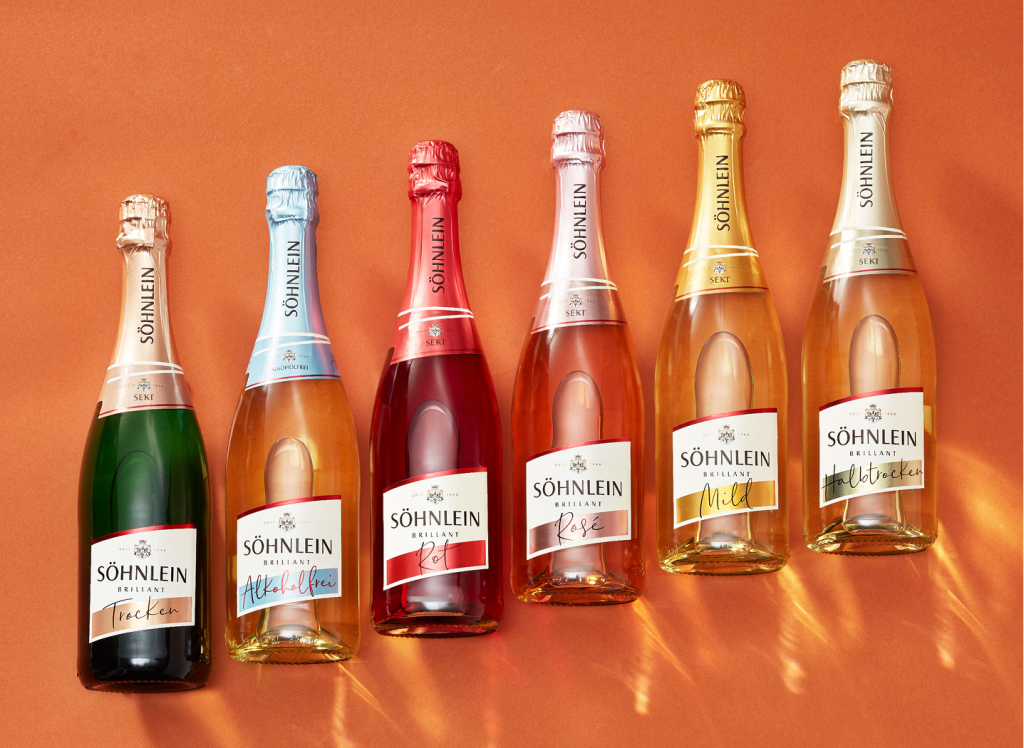
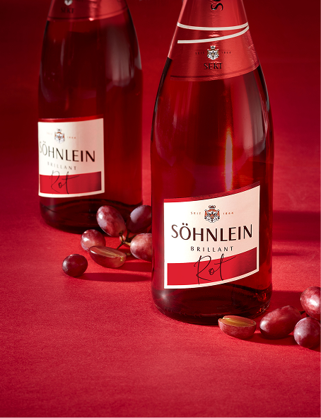
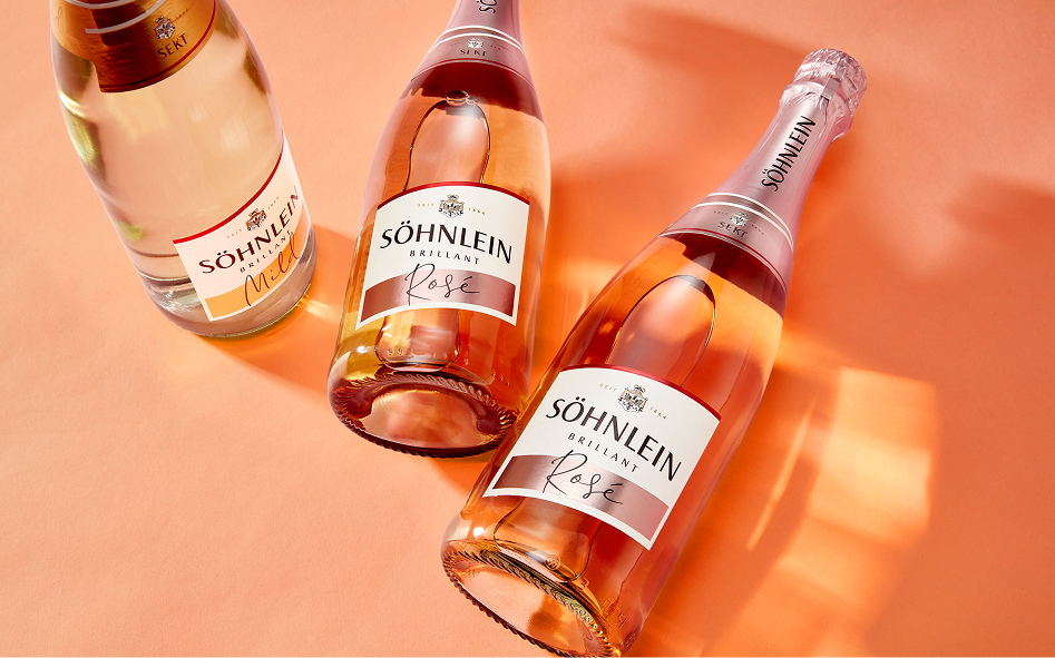
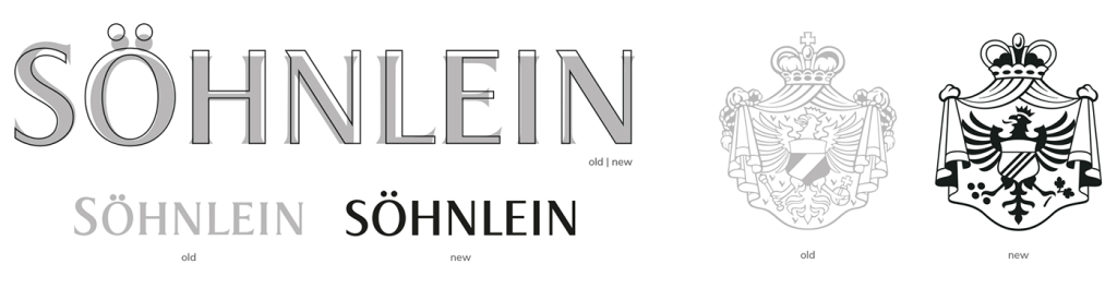
In Söhnlein Brillant’s long history—during which the brand has undergone 13 redesigns since 1964—this new design marks the most significant step to date. A completely new color palette featuring modern, bright metallic tones, a greater emphasis on white rather than gold, a relaxed, hand-lettered style of typography, and an overall clean design with simplified heraldry have driven a repositioning: shifting the brand from a sparkling wine reserved for special, festive occasions to one suitable for informal settings as well.
Scope: Logo // Packaging // Limited Editions