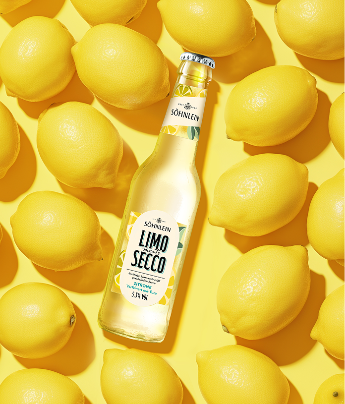
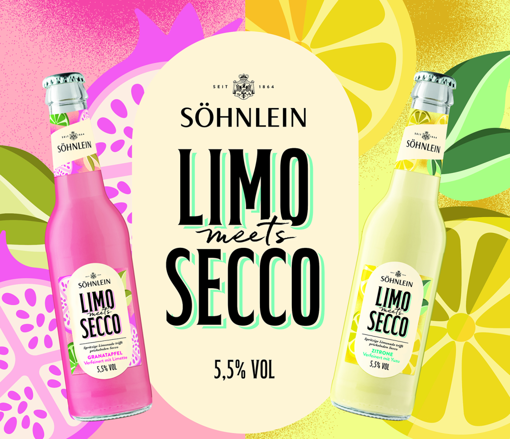
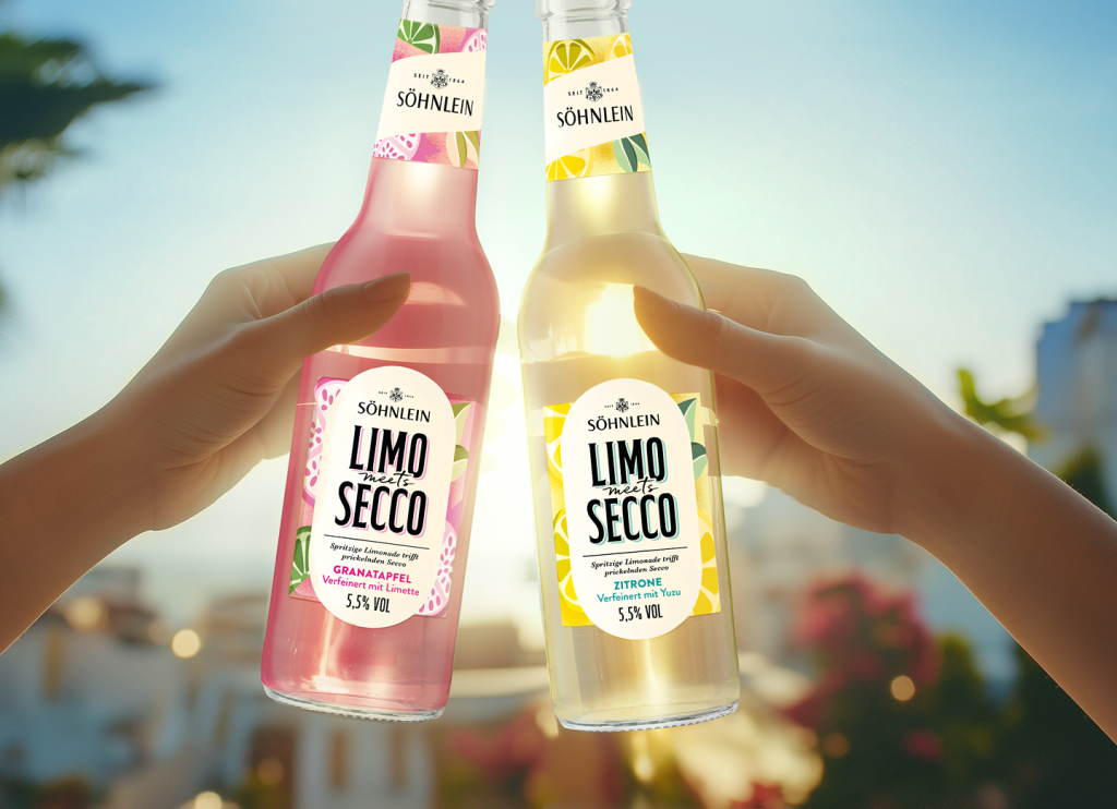
The project aimed to evolve the brand’s previously elegant and understated image into a strong presence for the grocery retail sector. The goal was to communicate the „0%“ message quickly and clearly while creating a more structured layout for product information.
The result: EASIP now presents a brighter, more modern, and distinctive look. An enlarged, white logo featuring subtly refined typography creates a striking contrast against the natural, understated background.
The new, bold „0%“ symbol conveys the brand’s alcohol-free positioning at a glance. Combined with a confident brand image, a restructured information hierarchy, and fresh contrasts, it ensures maximum visibility on the shelf.
A special highlight is the back label: evocative imagery brings the flavor profiles to life and underscores the unique character of each variety—a small yet eye-catching detail.
Scope: Relaunch // Sorten-Naming // Range-Erweiterung