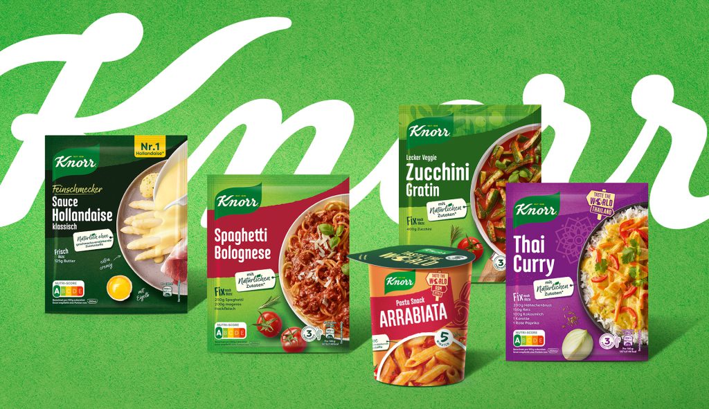
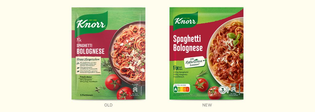
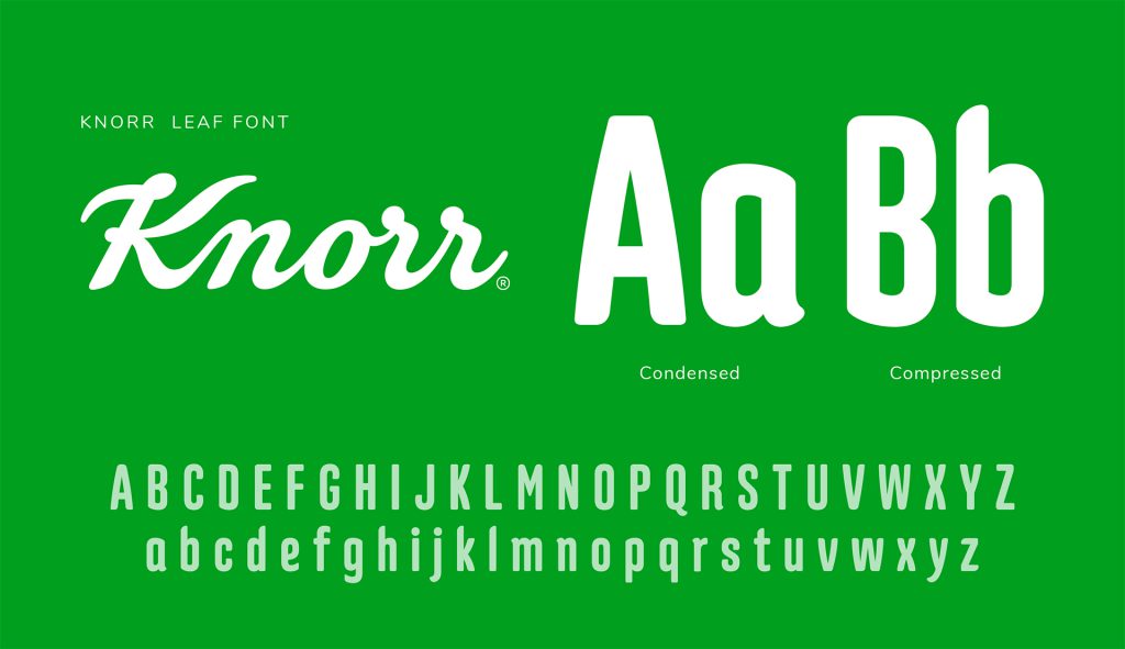
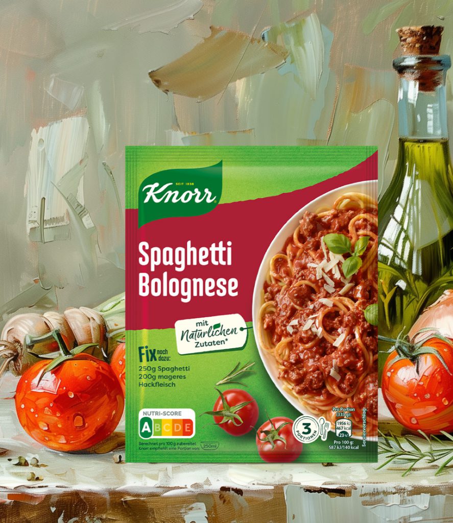
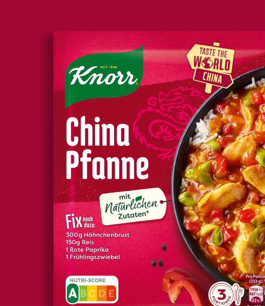
The task of brandcouture was to create unique design assets for the Knorr brand mark. The new banner swing design is derived from the shape of the Knorr logo. With the custom typefaces “Knorr Leaf Condensed” and “Knorr Leaf Compressed”, stylistically based on the Knorr lettering, further design assets were added. Enlarged and modernized food shots together with the new typefaces provide a clear structure on the pack – also by focusing on the key message “With natural ingredients” in a modernized and more emotional promise tag.
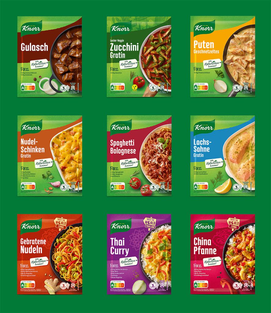
A new, vivid background with a modernized texture ensures improved shelf impact. Restructuring of the range using newly introduced color codes for the 6 categories: Meat, Fish, Oven, Vegetables, Poultry and Pasta. All this makes it easier to navigate the diverse, unique and challenging German “Stammregal”. The result of the relaunch is a packaging design with much more emotionality and food appeal for uncomplicated use in everyday life.
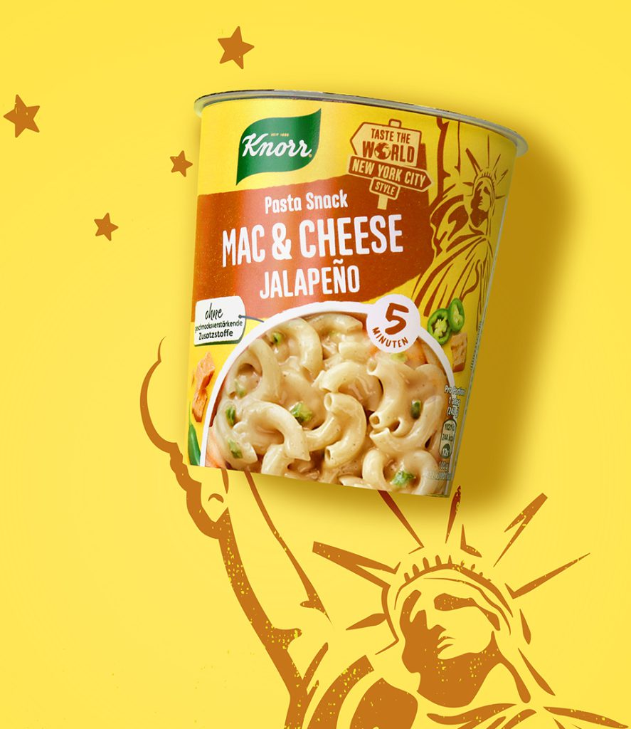
In addition, the development of new sublines, for example for vegetarians and vegans or country concepts that bring some exoticism into the range and invite consumers to try them out.
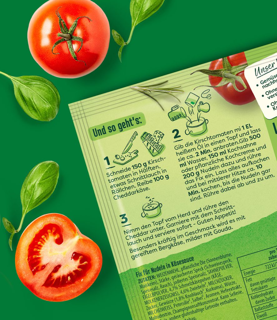
Restructuring of the back of pack and a fresh, casual illustration style also visualize Knorr’s brand philosophy “eat for good”.